
AI Summary
Why Dark Mode is Mandatory in 2026: The Ultimate Design Guide
Introduction: Dark Mode Is Not Just a Toggle Anymore

I remember when dark mode was a nerd flex.
If you were using a dark theme in 2010, you were either a developer running a terminal window at 2 a.m. or a designer trying to look edgy on Dribbble.
Today, it's different. Your phone, your browser, your code editor, your operating system - the default question isn't "Do you want dark mode?" anymore, it's "Why aren't you using it yet?"
But here's the thing you need to understand:Most dark modes out there are still terrible. Not ugly. Terrible.
Hard to read. Inconsistent. Eye-straining. Completely unaware of how light, color, and human vision actually work in low-light environments.
This article is my unapologetic attempt to fix that.
I'm going to walk you through how dark mode evolved, why it's much more than just flipping black and white, and how to actually design and implement dark mode that feels intentional, inclusive, and stable in real-world products.
If you've ever shipped a dark theme that "looked fine in Figma" but fell apart in a live product, this is for you.
By the end, you'll have a practical mental model, a checklist you can apply, and a much deeper sense of how to think about dark mode as a system - not a cosmetic afterthought.
The Evolution of Dark Mode in Web Design

From CRT Terminals to "Developer Aesthetic"
Dark mode predates the web.
Early computers didn't have "light mode"; they had dark backgrounds with green or amber text because of hardware constraints, not aesthetic intent.
When graphical user interfaces took over, everything flipped.
White backgrounds, black text, Windows, Mac OS - suddenly light-on-dark looked "technical" and dark-on-light looked "user-friendly."
On the web, dark themes initially lived on the fringes.
Developers used them in code editors, terminals, IRC clients, and early IDEs because prolonged staring at white backgrounds felt brutal at night.
Dark mode at this stage was:
- Purely functional and personal
- Mostly manual (you picked a theme in your editor)
- Rarely considered in mainstream product UX
Mainstream Adoption: When Platforms Got Serious
The tipping point came when operating systems and browsers stepped in.
Once Apple, Google, and Microsoft started baking dark themes into the OS itself, everything changed.
Suddenly, dark mode wasn't "your preference in an app"; it became a system-level signal.
Your device started telling apps: "This user prefers dark surfaces right now."
Two big things followed:
- Browsers exposed prefers-color-scheme so websites could adapt automatically.
- Users began expecting dark mode everywhere, not just in "techy" tools.
Once that expectation sets in, dark mode is no longer a "nice touch."
It's part of your product's baseline UX quality. You either meet that bar or you look dated, careless, or both.
Behavioral Shifts: People Actually Use This Stuff
Let's be blunt.
People don't use dark mode because it's "on-trend." They use it because it feels better in real contexts: late-night scrolling, dim offices, OLED phones, long reading sessions.
You've probably done this yourself:
It's midnight, you open a bright white site in bed, and your eyes get punched by light. That moment of "Nope" is what dark mode solves when it's done right.
As usage data piled up, patterns emerged:
- Users often prefer dark mode at night or in low light.
- Some people use it exclusively, regardless of environment.
- Others stick to light mode but still expect the option.
This means you're not just designing a "dark skin."
You're designing an alternative primary experience that a large portion of your users will live in all day.
Dark Mode as a Brand and Experience Differentiator
Here's the underrated part: dark mode is a brand moment.
It's where you prove that your system is cohesive, your design language is robust, and your team understands nuance.
Compare two products:
- Product A: Light mode looks polished; dark mode feels half-baked, with weird contrasts and off-brand colors.
- Product B: Both themes feel equally intentional, with subtle differences tuned to their environments.
Which one feels like a serious, trustworthy product?
Dark mode becomes a signal: "We didn't stop at the dribbble shot. We thought this through."
That's the bar now.
If you treat dark mode as an afterthought, people will feel it - even if they can't articulate why.
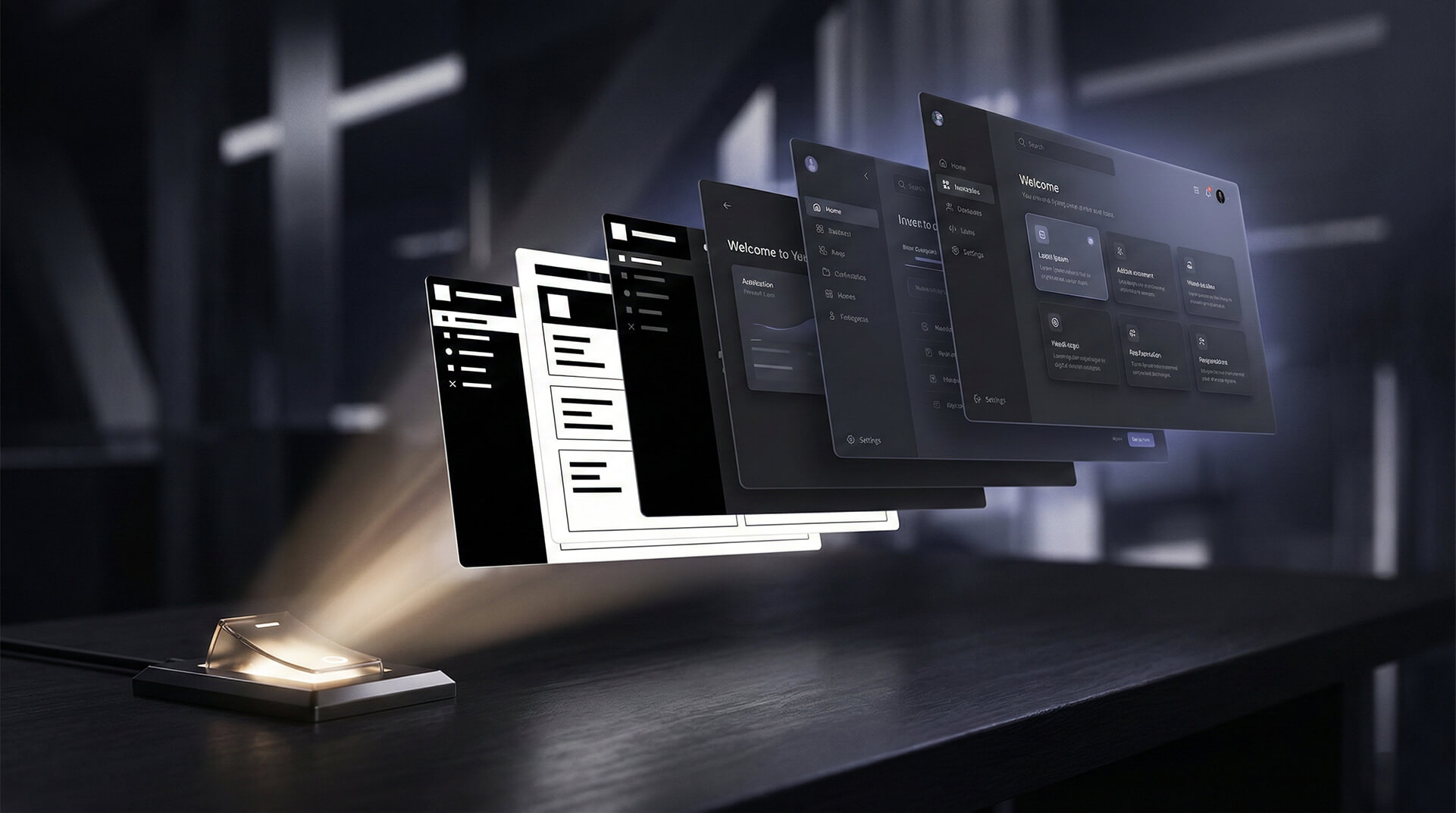
Why Dark Mode Is More Than Black and White

Why Pure Black Backgrounds Usually Fail
The first mistake I see everywhere: pure black backgrounds.
#000000 looks clean in a mockup, especially against neon accent colors, but in real usage it's brutal.
On OLED screens, true black pixels literally turn off, so you get infinite contrast against white text.
Sounds great - until you realize human eyes don't love extreme contrast over long sessions.
Pure white text on pure black is like reading glowing chalk on a void.
Edges halo, fine strokes blur, and your eyes work harder to converge on letterforms.
That's why most mature dark modes use dark grey, not pure black.
You'll see backgrounds around the #121212 to #1E1E1E range, which soften the contrast without losing that "dark" feeling.
Color Perception in Low-Light Environments
Your eyes don't behave the same way in dim light.
As ambient light drops, your rods (responsible for low-light vision) take over from your cones (responsible for color detail).
Translation: colors shift, saturation feels different, and subtle contrasts can totally vanish.
A color that looks perfectly legible on a bright display can feel muddy or low-contrast in the dark.
That's why you can't just invert your light theme.
In dark mode, you need to:
- Use slightly higher luminance steps between surfaces.
- Simplify your palette to avoid noisy, competing colors.
- Re-test key states (hover, focus, disabled) under real lighting conditions.
Reducing Eye Strain Is About Balance, Not Darkness
There's a myth that dark mode automatically "reduces eye strain."
It can help, but only if the contrast, typography, and layout are tuned properly.
What actually reduces strain?
- Moderate - not extreme - contrast between text and background.
- Comfortable line lengths and line height.
- Avoiding large pure-white blocks on dark surfaces (they feel like light bombs).
If your dark mode uses razor-sharp white (#FFFFFF) text on almost black, you've just created a different kind of strain.
Balanced contrast is the goal. Enough to be readable. Not so much that your interface feels like a strobe.
The Psychological Tone of Dark Palettes
Dark mode is emotional.
It changes the perceived mood of your product, whether you like it or not.
Dark palettes can feel:
- Focused and immersive (great for media, productivity, creative tools)
- Serious and premium (fintech, entertainment, dashboards)
- Intimate and calm (reading apps, night modes)
But they can also feel:
- Oppressive or heavy if everything is dark with no breathing room
- Edgy or "gamer-y" if overdone with neons and glows
You're making a tonal decision, not just a technical one.
A banking app dark mode should not feel like a cyberpunk poster. A meditation app dark mode shouldn't look like a hacker terminal.
Ask yourself: What emotional layer should dark mode add to this experience?
Then design for that, not for Pinterest aesthetics.
Accessibility and Readability in Dark Mode

WCAG Contrast Requirements Still Apply
Too many teams treat dark mode like a visual theme only.
Accessibility doesn't care which theme you're in.
WCAG contrast standards apply to dark mode just as much as light mode:
- Normal text: 4.5:1 contrast ratio
- Large text: 3:1 contrast ratio
- UI elements and icons: 3:1 against adjacent colors
Here's where it gets tricky.
In dark themes, designers often try to soften everything "to reduce strain," and they end up with low-contrast gray text on dark gray backgrounds.
That might look stylish in a Figma artboard.
On a real monitor with smudges, glare, and variable brightness? It's a legibility nightmare.
So no, you can't skip your contrast checks just because it's dark mode.
If anything, you need to be even more disciplined.
Typography Choices for Dark Backgrounds
Typography behaves differently on dark surfaces.
Bright text on dark backgrounds can "bleed" slightly, making thin fonts feel weaker and fine details disappear.
A few principles I stick to:
- Use slightly heavier font weights than in light mode for body text (e.g., 400 → 500).
- Avoid ultra-thin type for anything important.
- Give type enough line height so lines don't visually blur together.
Also, don't be afraid of off-white text.
Using a soft light gray (e.g., #E0E0E0) for body copy instead of pure white can make long reading much more comfortable.
Managing Glare, Halation, and Visual Noise
Halation - the glow around bright text on dark backgrounds - is real, especially on lower-quality displays or at small sizes.
You can't fully control the user's hardware, but you can design defensively.
That means:
- Avoid huge, dense blocks of bright text.
- Use hierarchy to break up content - headings, spacing, and grouping.
- Keep accent colors in check so they don't scream at the user in dark mode.
Visual noise is another common dark mode sin.
When every component has borders, shadows, gradients, and glowing accents on dark backgrounds, the UI turns into a noisy mess.
The darker the canvas, the more subtle you should be with decorative elements.
Let spacing and surface elevation do more of the work than lines and ornamentation.
Designing Inclusive Dark Mode Experiences
If you stop at aesthetics, you've missed the point.
Dark mode should be usable, not just cool.
Designing inclusively means you:
- Respect system preferences (prefers-color-scheme) instead of forcing your own defaults.
- Offer easy, persistent toggles so users can switch manually.
- Test with real users, including people with low vision or color vision deficiencies.
I'm opinionated on this: building a dark mode that's pretty but inaccessible is lazy.
If your product has time for micro-animations and custom gradients, it has time for contrast checks and usability testing.
Color Systems and Design Tokens for Dark Mode

Semantic Tokens vs Hard-Coded Colors
If you're still sprinkling raw hex values all over your CSS, dark mode will expose that chaos instantly.
The only sane way to manage light and dark themes at scale is with semantic design tokens.
Instead of hard-coding #FFFFFF or #1A1A1A in components, you define tokens like:
- --color-bg-surface
- --color-text-primary
- --color-border-muted
- --color-accent-primary
Then you map those tokens to actual color values in each theme.
The button doesn't care what the precise color is; it just asks for "primary background" or "primary text."
Result: switching themes becomes swapping token values, not rewriting components.
Designing Dark Mode Palettes as Systems
A great dark palette isn't a random set of hex codes that "look good together."
It's a structured ladder of surfaces and text colors that keep hierarchy intact no matter where they're used.
I like to think in layers:
- Background base: the default canvas (e.g., #121212)
- Surface low: cards, secondary containers
- Surface high: modals, popovers, top-level overlays
- Text tiers: primary, secondary, disabled
Each of these needs consistent luminance steps.
You should be able to look at your UI and say, "That's a higher layer" or "That label is secondary" instantly - without harsh lines or garish color breaks.
Handling Brand Colors Without Blinding People
Brand colors are where dark mode goes to die for a lot of teams.
That stunning electric blue or saturated red that sings on white might look radioactive on near-black.
Here's what I recommend:
- Create theme-aware variants of your brand colors (light and dark modes each get their own tuned values).
- Adjust saturation and brightness in dark mode so accents feel integrated, not neon.
- Test your brand colors against both backgrounds and various text colors, not just in isolation.
Your brand identity is more than a single hex value.
Protect the feeling of the brand, not the exact numeric color in every environment.
Maintaining Consistency Across Components
If your tokens and palette are solid, component consistency becomes easier - but not automatic.
You still need to police how those tokens are used.
Questions I always ask during review:
- Are primary actions visually consistent across pages in dark mode?
- Do similar surfaces share the same elevation and background tokens?
- Are neutral elements (e.g., toolbars, inputs, cards) all using the same token set?
If you're constantly inventing one-off colors "just for this component," your system is breaking.
Dark mode has a way of making that inconsistency painfully obvious.
UI Components, States, and Visual Hierarchy in Dark Mode

Interaction States Need More Than Color Changes
Hover, focus, active, disabled - these all behave differently on dark backgrounds.
A soft color shift that worked in light mode might be almost invisible in dark mode.
For states, don't rely on color alone.
- Add subtle elevation or shadow for hover.
- Use clear outlines or glows for focus (especially for keyboard users).
- Adjust opacity for disabled states, but never so low that they disappear entirely.
If the only indicator of "selected" is a slightly lighter gray on a dark surface, you're asking for confusion.
Use a combination of color, shape, and contrast shifts to make states unambiguous.
Shadows and Elevation: Be Subtle, Not Flat
Shadows work differently in dark mode.
On light backgrounds, you're darkening surfaces to simulate depth. On dark backgrounds, you often need lighter edges or soft glows to create separation.
Overdoing it leads to a messy, muddy interface.
Underdoing it can make everything look flat and undifferentiated.
A good dark mode uses:
- Slightly lighter surfaces for "raised" components (cards, popovers).
- Soft, low-radius shadows with low opacity, sometimes tinted toward the background hue.
- Occasional light borders or strokes to define critical edges.
Borders, Dividers, and Surface Separation
Bright borders on dark backgrounds are loud.
Thin white lines everywhere will make your UI look like a wiring diagram.
Instead, think in terms of separation, not borders.
- Use subtle contrast shifts between surfaces (e.g., #121212 vs #1C1C1C).
- Reserve clear borders for important delineations (e.g., focus states, input outlines).
- Use spacing and alignment as your primary tools for structure.
If you can remove a line and the layout still feels organized, do it.
Dark mode rewards minimalism in structural elements.
Creating Clear Hierarchy Without Extreme Contrast
Hierarchy isn't about cranking up brightness.
It's about clear visual relationships.
In dark mode, hierarchy can come from:
- Text size and weight differences
- Spacing and grouping
- Background depth and subtle surface changes
- Thoughtful use of one or two accent colors - not ten
If your solution to "make it stand out" in dark mode is "make it brighter," you'll quickly end up with a UI that looks like a dashboard in a sci-fi movie - fun for a screenshot, exhausting for daily use.
Data Visualization, Media, and Visual Assets

Designing Charts for Dark Mode
Charts are where dark mode truly tests your system thinking.
They're dense, colorful, and often critical for decision-making.
Common failures I see:
- Using light-mode colors untouched in dark mode, resulting in neon chaos.
- Gridlines that are too bright or too low-contrast to be useful.
- Data points blending into the background.
To make charts work in dark mode:
- Soften and slightly desaturate chart colors while maintaining distinct hues.
- Use low-contrast gridlines that guide without dominating.
- Ensure tooltip backgrounds and labels are clearly legible against both chart and page background.
The point of a dark-mode chart is still clarity, not mood.
If your chart looks gorgeous but takes more brainpower to parse, it's failing.
Icons and Illustrations: Not Just "White on Dark"
Icons require careful tuning.
Simple monochrome icons might look fine in light mode but either vanish or glare in dark mode.
Good practices:
- Use off-white or soft gray for default icons instead of pure white.
- Reserve highlight colors for active or critical states.
- Consider two-tone or duotone icons that preserve meaning across themes.
Illustrations are even trickier.
Light backgrounds baked into artwork can clash violently with dark UIs.
Whenever possible, create theme-aware variants of major illustrations.
At minimum, avoid embedding bright white backgrounds; use transparency so assets blend naturally into dark surfaces.
Handling Images and Media on Dark Backgrounds
Drop a bright image onto a dark canvas and you'll see the problem instantly.
The image becomes a spotlight, pulling all attention and making the surrounding UI feel dull or disjointed.
Here's how to fix that:
- Add subtle image frames or borders that slightly lift the image off the background.
- Use soft gradients or overlays to integrate hero imagery with surrounding content.
- Consider dark-mode-specific edits for frequently used hero or cover images.
Video players need careful treatment too.
Controls, timelines, and captions must stay legible whether the video is bright or dark.
Avoiding Color Misinterpretation in Data
Color perception shifts in dark mode can literally change how people interpret data.
A subtle green might look almost gray; a warning orange might look more red than intended.
To avoid misinterpretation:
- Verify that semantic colors (success, warning, error, info) retain their identity and are distinguishable.
- Don't rely solely on color for meaning - use shapes, patterns, or labels alongside.
- Test data-heavy screens specifically in dark mode, not just as a side-effect of your global theme.
This is one of those areas where lazy implementation can have serious consequences, especially in analytics, finance, or health interfaces.
Implementing Dark Mode in Modern Web Projects

Using prefers-color-scheme for Smart Defaults
If you ignore prefers-color-scheme, you're fighting the platform.
Browsers expose this user preference for a reason: people already told their OS what they like.
At minimum, you should:
- Respect prefers-color-scheme: dark and light in your CSS.
- Provide a manual toggle that can override the system preference if the user wants.
- Persist that choice (localStorage, cookies) so you're not forcing them to re-select every session.
Smart default = follow system.
Smart product = let the user decide.
CSS Variables and Tokens: Your Best Friend
CSS custom properties are practically made for theming.
You define tokens at the root, then override them under a dark-mode scope.
Typical pattern:
- Base theme tokens under :root.
- Dark theme tokens under [data-theme="dark"] or @media (prefers-color-scheme: dark).
Everything else - components, layouts, utilities - uses tokens.
You shouldn't be writing theme-specific colors in 90% of your component CSS if your system is well designed.
Framework-Based Implementations and Their Traps
Most frameworks - React, Vue, Next, Svelte, you name it - give you theming patterns or third-party libraries to start from.
The trap is assuming the default dark theme is "good enough."
It isn't, because:
- Generic palettes won't match your brand or product tone.
- Prebuilt components might pass contrast checks in isolation but fail in your context.
- Stateful components (menus, modals, toasts) often need custom tuning across themes.
Use framework presets as scaffolding, not gospel.
Then audit every critical UI pattern in both themes before you call it done.
Testing, Performance, and Long-Term Maintenance
Dark mode is not a one-sprint project.
It's a permanent axis of complexity in your design system.
To keep it sane long-term:
- Include both themes in your design reviews and QA processes.
- Add visual regression tests that snapshot key screens in light and dark.
- Document theme guidelines in your design system so new components respect both modes from day one.
On performance: avoid huge, duplicated CSS bundles for each theme if you can help it.
Token-based CSS variable strategies tend to be more efficient and easier to maintain than entirely separate stylesheets.
Conclusion: Dark Mode as a Measure of Design Maturity
If you've made it this far, you already know dark mode isn't just a "black coat of paint."
It's a systems problem, an accessibility problem, a branding problem, and a long-term maintenance problem.
The teams that nail dark mode aren't just good at picking colors.
They're good at thinking in tokens, hierarchies, semantics, and human perception.
So here's my challenge to you.
Stop treating dark mode as a checkbox for your marketing site and start treating it as an equal citizen in your product design.
Audit your current implementation.
Fix your tokens. Tune your brand colors. Rebuild your charts. Test with real people in real lighting conditions.
When your dark mode feels as natural, readable, and trustworthy as your light mode, that's when you know your design system has grown up.
Anything less is just aesthetic cosplay.
FAQs
- Verify Contrast Ratios: Text must have a minimum contrast of 4.5:1 against the background. Use tools like the WebAIM Contrast Checker or Stark to validate.
- Soften the Background: Avoid pure black (#000000). Use a dark grey surface (around #121212) to reduce eye strain and halation (blurring) of text.
- Desaturate Accents: Bright, saturated colors vibrate on dark backgrounds. Lower the saturation of your brand colors to make them legible and accessible.
- Clear Focus States: Ensure interactive elements have a high-contrast outline or glow when focused via keyboard navigation.


0 Comment(s)
Be the first to leave a comment!